
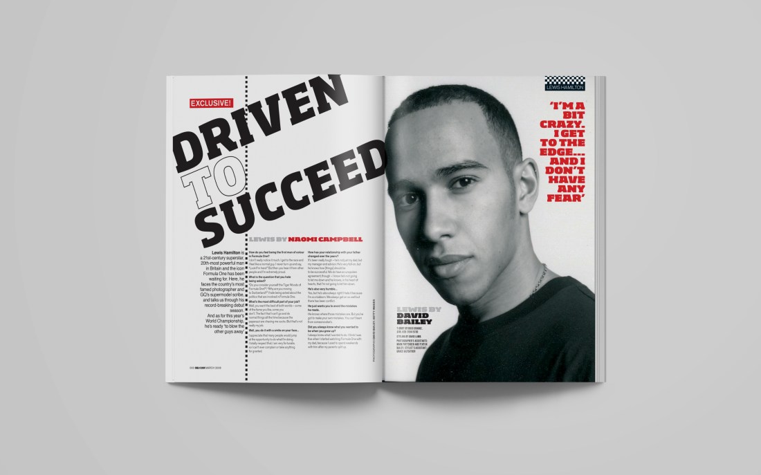
https://stevebains.co.uk/GQ-Magazine
Introduction
This magazine spread comes from the very famous and critically acclaimed, GQ! GQ has featured so many amazing fashion icons including Kourtney Kardashian, Harry Styles, David Beckham, Bella Hadid, Ed Westwick, and Frank Ocean.
The author of the article, Driven to Succeed is Naomi Campbell and David Bailey did the photography. I got the link from Steve Bains website, who is a layout designer. All of his personal work is placed there in a portfolio.
Photography
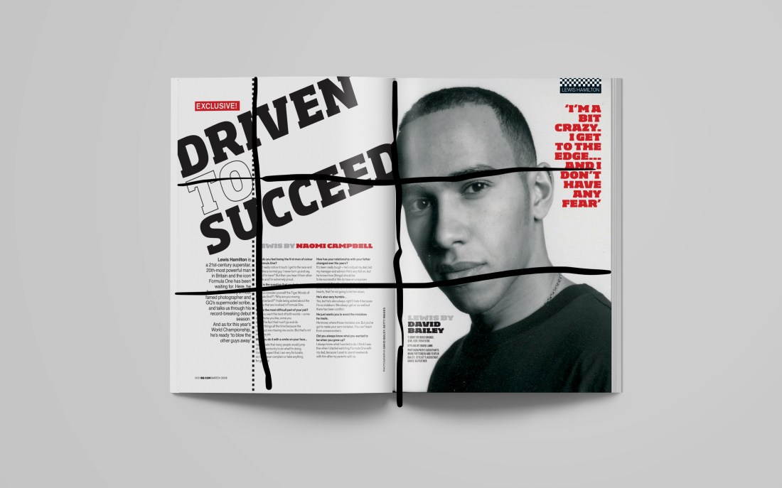
This image is captivating, especially in the black and white. It makes the red pop as a contrasting color. The designer did a good job keeping the piece simple, yet eye catching. Also, the black and white shows the serious tone of trying to succeed and being determined to get there. Just his face indicates that this article is featuring him as someone who has succeeded.
Typography
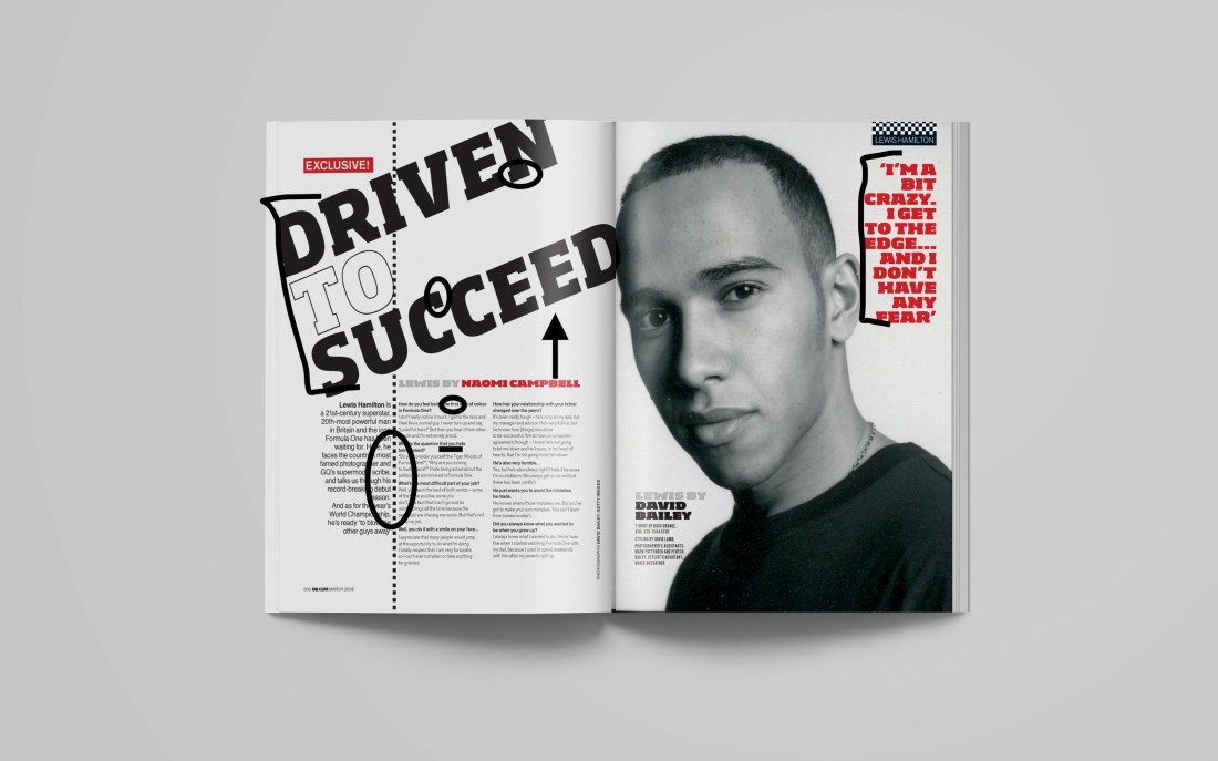
The first main font is slab serif. You can tell because of the strong header and the strong visible serifs. The other in the body text is sans serif because there are no serifs! It is a good choice for body text because it is simple and readable. I also like the boldness of the red font and it makes the text pop, leading your eye to what the one in red is saying without overpowering it.
My Images

Rule of Thirds: I took this on my flight home! It is rule of thirds because the airplane wing is on the left side of the image. Sometimes, in rule of thirds, there can be dead space but I like how the sun and lake are there to add detail.
 Shallow Depth of Field: This image is one of my favorites. Me and my roommates explored Jackson Hole, Wyoming! This picture represents shallow depth of field because she is in focus and the rest of the background is slightly blurred.
 Deep depth of field: I also took this one in Jackson Hole. It is a deep depth of field because you can see all the details of the trees, snow, and cute building.
I feel like all three of these images could portray willing to succeed. They would just have to change the color scheme. Also it was hard because the article was about a certain person in mind. I have not met him so it would be hard to submit pictures for it.

 abby jorgensen